

11·
2 years agobut …surely you could just do the same thing with the old design? artist’s rendition:

in fact, now i look at it, it makes them look even more similar once i collapse the sidebar
Il faut imaginer Camus hébété.

but …surely you could just do the same thing with the old design? artist’s rendition:
in fact, now i look at it, it makes them look even more similar once i collapse the sidebar
meh, subjectively i find that creates a “worst of both worlds” situation. but this comment was more about the futility of the development time that went into this specific feature
maybe; but if the location of menu buttons hints at their use then the hamburger should collapse the side drawer like the one on e.g. youtube, but i doubt it does
I had to look up Fitts’s law, and I’m not sure I get it. Could you explain what you mean?
basically; the speed that it takes to click a button is dependant on the size of the button and the distance from the cursor. however, buttons at the edge of the screen have effectively infinite size, as they can’t be overshot. the most used actions should be placed there, as they are the easiest to click by muscle memory (particularly the corners, as they have infinite size in both dimensions)
on windows, kde, cinnamon, etc.; by default the bottom left is start, the bottom right is show desktop (this one i can’t explain), and the top right is close maximised window. the top of the screen is also used for other window-related actions like minimise, restore, change csd tabs, etc.
gnome flouts this by having most of the top of the screen doing nothing (most of it is completely empty) apart from rarely used actions like calendar and power. and the bottom right and left doing nothing[1]
did i explain well?
ETA: I kinda feel like mine was about KDE not being a fit for me personally, and yours was a slam on Gnome rather than a statement of personal preference.
nah it was very much a personal thing: some people like having a minimal and clutter-free feature set; i like having as many features as possible, because then i find features i didn’t even know i liked.[2]
as for the top bar: this one confuses me - it just seems objectively bad. but obviously it’s not as some people clearly like it. i haven’t had anyone actually explain to me why, though
i didn’t know how useful a terminal embedded in the file manager would be until i started using dolphin, now i can’t do without it ↩︎
every time i try to use gnome, i end up spending all my time going “dammit, where are all the bleeding features”
(also the lack of fitts’ law adherence due to that pointless bar at the top)
yep, that’s me
i’m not even sure it’s worth having an option. i don’t think i’d even have noticed a difference, apart from the menu button being in a slightly different place to every other gnome app. it’s fine; but it wasn’t worth the development time
who even decides what’s “modern” anymore?


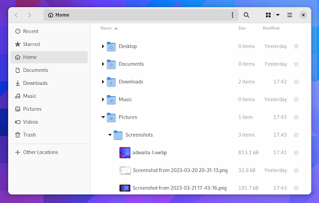
edit: people are getting confused by the fact that one is tree view, not icons view so i changed the image. old image here

actually i almost went for sdf instead of l.ee. the reason i didn’t was that it seems almost too good to be true? i see so many sites around that proclaim they’re hosted on sdf, the biggest text on their homepage says “create a free account” and yet there isn’t a donate button
i realise there’s one on their lemmy instance, and i might choose them if l.ee does fold, but i felt like i was taking advantage of something meant for others
yeah you’re right, but i’m not (just) being funny when i said that - lemmy.world had only just started when i joined (10 days), still had the old (much nicer) icon and no banner, etc. it had 188 users / month, compared to .ml’s (at the time) 1.8k and lemm.ee’s (current, according to the above infographic) 3.7k…
well actually, i did recently make a backup acct. on lemmy.dbzer0.com…
but what if going away makes it worse? .world’s downtime has only increased since i made my l.ee acct
goddammit
i joined dxcomplex because it was the smallest instance i was confident wouldn’t fold (and i liked the name);
then it folded so i joined .world because it was the smallest instance i was confident wouldn’t fold (and i liked the name);
then it got massive so i joined lemm.ee because it was the smallest instance i was confident wouldn’t fold (and i liked the name)
i’m starting to wonder if i’m cursed

well it’d obviously have to be digital, and it would be nice if it were secure as well
maybe down the line we could get a high capacity version, or even xtreme capacity
deleted by creator
Left or right edge, it’s the same. If you are holding your phone with your right hand, your thumb is either holding the phone by the right edge, or is just hovering on top of it.
OH. alright, i didn’t know that, that’s much better
At least on LineageOS it can register a diagonal swipe as long as it sorta fits into a 45° angle, either downwards or upwards.
yeah alright, that seems pretty reasonable then. i think that does sound fairly consistent and predictable
You don’t need to reach the middle bottom of the screen, any area on the bottom can trigger the home/recents gesture.
okay actually that is good then. that’s perfectly fine. (although when compared to buttons, i still don’t know how i’m supposed to reach the left edge to go back)
The notification drawer has a bigger and more visible trigger area, tho.
yeah fair point, but it’s still the same paradigm of an item that gets dragged into the screen
I thought you were talking about system gestures, not nav drawer
i was sort of talking about interaction inconsistencies, but alright let me rephrase: a swipe right goes back, but a diagonal swipe does [presumably] nothing despite them being pretty semantically similar
I made it implicit, but forgot to say out loud: While system gestures makes the open-drawer-edge-gesture worse to the point of unusable, I think that looking back it wasn’t that good to begin with. Which is why I think Material Design never officially supported it in the first place, way before gesture navigation was a thing.
i mean, i’d say it’s better than nothing. otherwise one has to reach all the way up to the top to press the hamburger menu
The pill-thingy is anchored to the bottom of the screen, so basically it always point to the ground, the back gesture is on the side. It isn’t uncomfortable because it matches the easiest point to reach, which is the side of the screen relative to the user, not the device. This very old image shows the most reachable areas of a screen:
that doesn’t seem hugely ergonomic - i can hardly reach the bottom middle of my phone, let alone the left edge
Either that, or you were reaching into the realm beyond the screen to bring it on. That is something that I never quite liked for app gestures, because not only is it implied that things exist outside the screen(which is fine), but that you can somehow reach for them.
well yeah, it’s this exactly. your finger starts from off-screen, where the drawer is currently hanging out, and drag it on-screen. almost exactly the same as the notification drawer, the control centre on ios, or that stupid “charms” thingy on win8
Erm, there is no diagonal swipes, at least officially from Google. You just swipe perpendicular to the edge of the screen. So from the bottom edge you swipe up, from the left edge you swipe right, right edge to the left
i thought that was how one opened nav drawers with gestures enabled? a diagonal swipe; or swipe, wait, then swipe a bit more (which i’m not even going to go into how awful that is). including in official google apps?

nah, i agree with you. win explorer with qttabbar, tortoisegit, and some tweaks from winaerotweaker
dolphin is pretty good though and it has some features that explorer doesn’t, like a terminal pane